Context Menu Functionality
The context menu contains the main functionality of the GUI.
View All
- Adjusts view in gui so that all the data is visible
- This same function has a short cut:
- Click the A inside a box that appears in the bottom left corner of the gui
X Axis
- You can either be in “Manual” or “Auto” mode which is specified by the selected “radio button” next to the labels.
- When in manual mode, the plot will show the data in the bounds specified in the entry boxes, which can be changed by the user
- When in auto mode, the bounds of the data will change as data is added
- If the “auto pan only” checkbox is NOT selected, the bounds will expand to show all of the generated data
- If the “auto pan only” checkbox IS selected, the width of the plot window will stay fixed but the plot will show the most recent data can continue to show the most recent data as new data is acquired
- The “auto visible only” checkbox will not dramatically change the behavior of the plot. This feature is more impactful along the y axis
- The “invert axis” checkbox inverts the axis such that large x axis values appear on the left instead of the right
Y Axis
- The y axis menu behaves largely the same as the x axis menu
- Key differences:
- In the “auto” mode, the autopan feature is not supported on the y axis. Checking or unchecking the “auto pan only” checkbox will trigger an information popup indicating this and will not change the functionality of the plot
- In the “auto” mode, the “auto visible only” feature will make the y axis stretch and shrink to only show the window on the y axis for which there is data
- This behavior is particularly relevant if, for example, a periodic function is being plotted while auto panning along the x axis and the width of the autopan window is less than the period of the function
Mouse Mode
- This provides easy customization of the view bounds of the plot
- There are two options:
- Click and Drag:
- When you click on the plot and drag the mouse, the location on the plot that was clicked will follow your mouse to change the visible bounds
- Rectangle Select:
- When you click and hold your mouse, you can drag the cursor to select a rectangle
- When the mouse is release the bounds of the visible plot will show the
- Regardless which mode you are in, scrolling with your mouse on the plot will zoom in or out
- Using either of these methods automatically changes your mode to “manual” in the X and Y Axis menus. To return to “auto” mode, either manually click the “auto” radio button in the corresponding menu OR click the small boxed capital A in the bottom left corner of the GUI
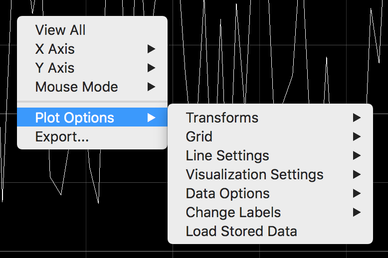
Plot Options
- The plot options submenu contains functionality to customize the appearance of the plot (e.g. line color, background gridlines, and log or fourier mode) as well as the treatment of the data and settings (e.g. autosaving data, restoring previous settings, and loading previously saved datasets).
- This is where the vast majority of the functionality is built in. All of the below suboptions are contained in the Plot Options submenu.
Transforms
- By checking Power Spectrum (FFT), the plot will show a fourier transform of the data
- If the “local fourier mode” checkbox is selected, this fourier transform ONLY applies to the subset of the data whose x values falls within the x bounds currently shown in the GUI
- If “local fourier mode” checkbox is NOT selected, the plot will show a fourier transform of ALL of the data that has been collected to that point
- You cannot turn on the “local fourier mode” while already plotting a fourier transform
- This prevents taking a transform of a transform
- A popup box indicating the issue will appear
- By checking the Log X or Log Y checkboxes, the plot will shift the corresponding axis into Log scale
- If there are values that are not able to be taken into log mode (e.g. negative values), the plot may disappear when you try to apply log mode
- If the plot disappears, simply unchecking the log box that caused it to disappear will bring the plot back
- While the plot is not visible, data is still being collected as normal
- You can check multiple of the transform boxes to apply their effects at the same time
Grid
- By checking the x grid or y grid, background reference gridlines appear to indicate values only the chosen axis.
- The opacity slider determines how dark or faint the gridlines appear
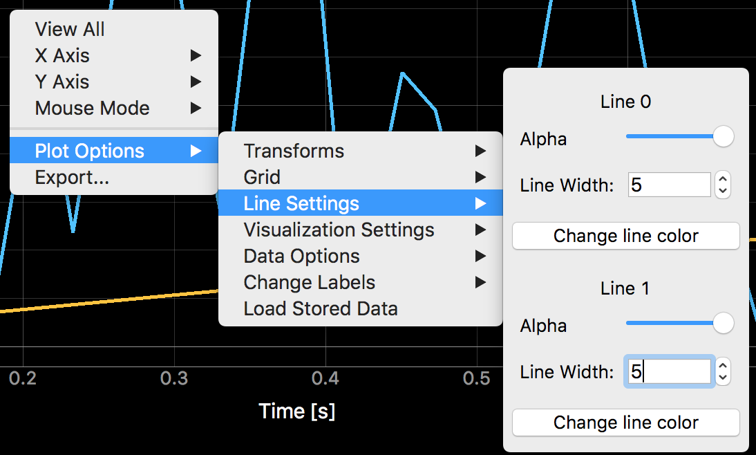
Line Settings
Visualization Settings
- Restore Default Plot Settings
- The library has default settings defined in plot_item_settings.py
- You can hard change the defaults in that python file
- If you wish to return to these settings, simply press this button
- Restore Saved Plot Settings
- This takes the values of the parameters in the custom_setting.JSON file and loads them into the GUI, replacing the settings that were present at the time
- Together with “save current plot settings” this allows you to save your settings, change them, and then revert back to the saved settings if you want to discard your recent changes
- Save Current Plot Settings
- This manually forces all of the current values of the tracked parameters to be stored to the “custom_settings.json” file
- This operation is done automatically when you close the GUI, but at any other time, you must do it manually if you wish to save it
- Together with “Restore saved plot settings” this allows you to save your settings, change them, and then revert back to the saved settings if you want to discard your recent changes
- Clear Line Settings
- This button functions similarly to “restore saved plot settings” except it only applies to the qualities found in the line settings menu: alpha, width, and color
- Since line settings are purely aesthetic, this allows reversion of the visual qualities of the lines without changing properties that are potentially more critical
Data Options
Clear Data:
- The clear data button removes all of the data from the plot
- This does not delete the data from the store_data.json file, but if you were to save anything, the cleared data would be lost permanently
- This feature is most valuable when “clear old data on start” is NOT checked
- In this case, if you want to discard the data that is loaded automatically when the GUI opens before you start collecting data, you must do so manually with the “clear data” button
Clear Old Data on Start
- When the GUI is opened, the data that was present
- When the “clear old data on start” is checked, the old loaded data is discarded automatically when you start collecting data
- If the checkbox is NOT check, the plotting will behave as a continuation of this old data
- Note that this generally results in a long horizontal line through the gap time period to connect the last data point before the GUI was closed and the first datapoint after it was reopened
- Having this checkbox checked is recommended because the gap in the data from when the GUI was not running is not meaningful
Automatically save data * If the checkbox is NOT checked, data will only be saved when the plot is closed * If the checkbox IS checked, data will be saved automatically periodically
- The frequency of the autosaving is determined by the integer entry box
- After N new data points are collect, where N is the number in the entry box, the data is saved
- The entry box can be any integer from 10 to 1000
- WARNING: Frequency autosaving when gathering data over long periods of time may affect performance
Change Labels
- The “change plot title”, “change x axis label”, and “change y axis label” each trigger a popup box that allows you to enter text to replace the corresponding label
- If you press cancel or simply close the popup without clicking “OK”, the title will stay the same as before the popup appeared
- Relative time markers:
- When checked, the plot will interpret the time that you press play as zero. All times will be given in reference to that zero point
- When NOT checked, the plot will indicate the time on a 24 hour clock
Load Stored Data
- This button allows you to load data stored in json files (and formatted appropriately) into the GUI
- When clicked, a finder window popup up will appear for you to pick the JSON file with the data you want to load
- To abort simply press cancel
- After selecting a JSON data file, another finder window popup will appear for you to pick a JSON file with custom settings you want to load
- Picking custom settings is optional
- To load the data without custom settings simply press cancel
- The data will appear in the GUI (with the custom settings is you selected a settings file)